Hello all,
So here I am sat here at home with a bad case of Laryngitis, no voice and having come home from work early as trying to communicate with the customers in the café was proving rather difficult and the heat today was making a rough me feel faint, I thought I'd sit quietly and show you my latest layout as I cannot sit and do NOTHING!
So here I am sat here at home with a bad case of Laryngitis, no voice and having come home from work early as trying to communicate with the customers in the café was proving rather difficult and the heat today was making a rough me feel faint, I thought I'd sit quietly and show you my latest layout as I cannot sit and do NOTHING!
Today I want to share with you my layout for the Swirlydoos Kit Club May Round Robin Challenge.
I was on Team 1 and creating on Week 3 following fellow team members Kathi and Kim.
We have a theme and some twists to the challenge every month.
This month we had have:
THEME: 40% white space with mixed media.
TWISTS: * Spring, fun photos
* Swirly style layout
* Embellish but don't over embellish
The idea is to 'lift' the layout of your previous team mates, meet the theme/twists criteria and to interpret it with your photo and choice of papers.
The idea is to 'lift' the layout of your previous team mates, meet the theme/twists criteria and to interpret it with your photo and choice of papers.
Here is my layout:
Now for some details and close up's.
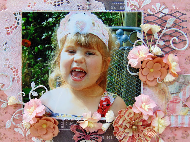
I kept exactly to the design that Kathi originally designed and Kim also kept to. I liked the 'cross' effect design. In both Kathi's and Kim's layouts they had used an embellishment to the right that mimicked an element from their photo. I used a lattice die to mimic the design of the metal chair that DD Holly is sat on.
The chippie was also another major part of the 'lifted' layout.
I used this Dusty Attic piece which I first painted with gesso and then covered with Silver Pearl embossing powder. I then used two different colours of mica powder which I added very quickly whilst the embossing powder was still warm and tacky and it has stuck on!
The antique doily I thought matched Holly's tiara perfectly so all I did was alter the colour to match with some of the paler mica powder by simply rubbing it over!
I copied the punched border to the vertical banners with a different design, mine was done with a edge die.
The original 2 layout didn't have any mixed media on... well you know me....I couldn't resist especially as it was on the brief! So I added a minimal amount to the sides of my banners. I also added a few splats with a Prima Color Bloom mist, just softly in the background, the one I used was Peony, it is very subtle in the background.
Here is the top piece of the chippie showing the effect with the embossing power and the mica powder.
I tried to keep the flowers and the embellishments to a minimum as required, which is quite difficult for me! But on this occasion, less is more!
I love tis die that I used for the swirl flourish, it just finishes of the flower clusters perfectly! And cut with the script print from one of the Something Blue papers adds a nice effect.
All my edges were distressed as probably expected of one of my layouts!
This is a photo that my parents took of Holly when visiting them. She was having a good chuckle about something! A lovely fun smiling photo!
Products used on this layout:
* Prima Marketing; Something Blue; goin' to the chapel
* Prima Marketing; Something Blue; wedding planner (both sides)
* Prima Marketing: Something Blue: enchanted blooms
Prima Marketing: flowers; Avante: cedar #566647
Wild Orchid Crafts flowers: Apple Blossoms; pastel tones mkx469
Wild Orchid Crafts flowers: Gypsophila flowers: Ivory gst228
Dusty Attic: Chipboard: Ornate Pendants: DA 4359
Prima Marketing: Color Bloom Mist: Peony
Pearl Ex: Mica Powders: Pink Gold
Pearl Ex: Mica Power: Blue Russet
Tim Holtz: Distress Grit Paste
Kaisercraft: Die: Lacey Borders
Prima Marketing: Stencil
Memory Box Die: Lattice background
Joy! Crafts Die: Flourish Swirl small
Thanks for taking the time to visit my blog,
See you again soon!
Ginny :)


No comments:
Post a Comment