Tuesday 30 May 2017

***Sketch Challenge at Swirlydoos Kit Club***

"Hello" crafty friends!

Another day and another layout. :)

Today I want to share with you my layout for the sketch challenge at Swirlydoos Kit Club.

I am loving the sketches that Kim is creating for the Swirlydoos monthly sketch challenges and I particularly enjoyed the design of this one!

My layout as been created with 98%  products from previous  Swirlydoos Kit club  Kits.


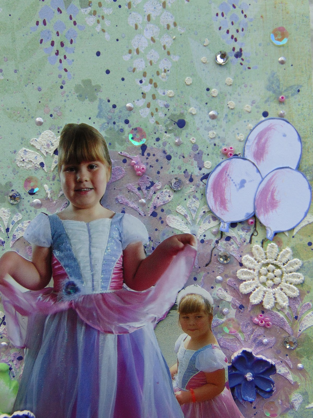
Here is my layout .......


and now to show you the sketch....


So as you can see I have used a oblong frame rather then an oval frame. This wooden frame from a previous swirlydoos kit was simply painted with a couple of coats of gesso.


In the top right hand corner of the sketch there is a small frame. the one I added to my layout is made with a Martha Stewart mould with Ice Resin, the Ice Resin is also from a previous Technique it Add on kit from Swirlydoos.


The brick work I created with a Stencil and my favourite Distress Grit paste.
I also used a Finnabair small background clear stamp, crackle effect in my background, painted the stamp gently with gesso and stamped with it to get the white crackle over the background. I then splattered over the background with some black acrylic paint.


The title is a Heidi Swapp acetate word. I used a clear glue to adhere this to the page, just adding a dot of the glue on the extreme edges of the word.


My two beautiful focal point flowers are by EK Success. They have a very pretty floral print which had all the colours on them that I was using on my layout. I mixed these in with some Petaloo black burlp flowers.


The only items used on this layout that are not from a previous Swirlydoos kit are the dusky blue paper roses and the pale sky blue apple blossoms flowers from Wild Orchid Crafts.
The quote in the small frame I cut out from a card in the Collectables pack and glued  to back of the frame.


I used some seed beeds to add a  different type of texture and a high light colour. These are stuck to the layout using gel medium.


The finishing touch in the flower clusters are the very delicate Butterfly laser cuts from BoBunny. These I left untreated and poked them into the flower layers.


Products used on this layout:

Kaisercraft: Barber Shop: Comb
Kaisercraft: Always & Forever: Devotion
Kaisercraft: StoryBook Collectables
Darice: Seed Beads: Metallic Teal
Darice: Wooden frame
Wild Orchid Crafts: Dusky Blue Paper Roses
Wild Orchid Crafts: pale blue: Apple Blossoms
Heidi Swapp: Acetate Words
Gesso
Acrylic Paint: Black
Finnabair: Clear Stamp: Crackle
Petaloo Flowers: Textured Elements: Burlap Blossoms: Black
EK Success: Blue Lace Floral Mum flowers
Martha Stewart: Mould: Frame
Ice resin


I hope you liked this layout, I was pleased with how this turned out and noticed
afterwards that it had ended up in my favourite colour combo, pale blues and beiges, which at the start hadn't been planned but I loved it!

Thank you for stopping by my blog today!


Ginny :)


Wednesday 24 May 2017

***May Round Robin Challenge at Swirlydoos***

Hello all,

So here I am sat here at home with a bad case of Laryngitis, no voice and having come home from work early as trying to communicate with the customers in the cafĂ© was proving rather difficult and the heat today was making a rough me feel faint, I thought I'd sit quietly and show you my latest layout as I cannot sit and do NOTHING!


Today I want to share with you my layout for the Swirlydoos Kit Club May Round Robin Challenge.

I was on Team 1 and creating on Week 3 following fellow team members Kathi and Kim.

We have a theme and some twists to the challenge every month.
This month we had have:


THEME: 40% white space with mixed media.

TWISTS:  * Spring, fun photos
* Swirly style layout
* Embellish but don't over embellish

The idea is to 'lift' the layout of your previous team mates, meet the  theme/twists criteria and to interpret it with your photo and choice of papers.


Here is my layout:


Now for some details and close up's.


I kept exactly to the design that Kathi originally designed and Kim also kept to. I liked the 'cross' effect design. In both Kathi's and Kim's layouts they had used an embellishment to the right that mimicked an element from their photo. I used a lattice die to mimic the design of the metal chair that DD Holly is sat on.  


The chippie was also another major part of the 'lifted' layout.
I used this Dusty Attic piece which I first painted with gesso and then covered with Silver Pearl embossing powder. I then used two different colours of mica powder which I added very quickly whilst the embossing powder was still warm and tacky and it has stuck on!


The antique doily I thought matched Holly's tiara perfectly so all I did was alter the colour to match with some of the paler mica powder by simply rubbing it over!


I copied the punched border to the vertical banners with a different design, mine was done with a edge die.
The original 2 layout didn't have any mixed media on... well you know me....I couldn't resist especially as it was on the brief! So I added a minimal amount to the sides of my banners. I also added a few splats with a Prima Color Bloom mist, just softly in the background, the one I used was Peony, it is very subtle in the background.


Here is the top piece of the chippie showing the effect with the embossing power and the mica powder.


I tried to keep the flowers and the embellishments to a minimum as required, which is quite difficult for me! But on this occasion, less is more!


I love tis die that I used for the swirl flourish, it just finishes of the flower clusters perfectly! And cut with the script print from one of the Something Blue papers adds a nice effect.


All my edges were distressed as probably expected of one of my layouts!
This is a photo that my parents took of Holly when visiting them. She was having a good chuckle about something! A lovely fun smiling photo!  


Products used on this layout:


* Prima Marketing; Something Blue; goin' to the chapel
* Prima Marketing; Something Blue; wedding planner (both sides)
* Prima Marketing: Something Blue: enchanted blooms
Prima Marketing: flowers; Avante: cedar #566647
 Wild Orchid Crafts flowers: Apple Blossoms; pastel tones mkx469
Wild Orchid Crafts flowers: Gypsophila flowers: Ivory gst228
Dusty Attic: Chipboard: Ornate Pendants: DA 4359
Prima Marketing: Color Bloom Mist: Peony
Pearl Ex: Mica Powders: Pink Gold
Pearl Ex: Mica Power: Blue Russet
Tim Holtz: Distress Grit Paste
Kaisercraft: Die: Lacey Borders
Prima Marketing: Stencil
Memory Box Die: Lattice background
Joy! Crafts Die: Flourish Swirl small


Thanks for taking the time to visit my blog,

See you again soon!


Ginny :)


Sunday 21 May 2017

More May challenges

Hello all!

Phew!! What a busy week its been! I haven't had time to do any scrapbooking all week! I've been so busy with work, the kids extra activities and an extra job I've been doing this week, and a tennis tournament with my daughter too, which was very successful for her!

This layout I created last weekend  and have only just got around to editing the photos of it today!


This layout was created for the following Challenges....


with their May Single Page Sketch


with their 'Tic Tac Toe challenge'


I chose to do a mixed media layout for these challenges.


I chose the line was '3+patterned paper - Tickets - Vellum' from the  Tic Tac Toc challenge board.
In this photo you can see 3 patterned papers, the tags, the background script paper and the stripe paper.


On my background paper I started off with mists, the navy Perfect pearls mist and the beige color bloom mist. I use the netting stamp with coffee archival ink randomly over the design area. I also used a stencil with some distress grit paste (you could use texture paste instead) again randomly over the design area. The 'be happy' was covered with Picket Fence paint dabber.


I wanted to create a beachy effect with my mixed media. I first started with the 3d balls for a pebble look. These were adhered with some gel medium. The Flower Soft Ultra Fine Sand is absolutely perfect for beach themes! I looks just like sand. Use a glue/gel medium on your layout and then sprinkle over the top and shake the excess off (like you would with glitter). The frantage fragments added to the pebbly look.


I used the tickets that are part of the Pion Seashore collection and inked the edges with the Farmers Jeans ink pad. I used real shells on the layout we collected from the beach.


The little pegs I liked as an extra little feature. The arrows I simply 'painted' with the Navy perfect Pearls mist. You can also see that I used some jute weave tucked under the photo mount and layers and worked the mixed media in top.


The vellum was incorporated into the layout with these rosettes made with a Tim Holtz die. this vellum had a black pattern on it which matched the string on the tags.


All my paper layers were inked with the Farmers Jeans ink pad. The photo and the photo mount I cut using some x-cut nesting dies. I liked the effect of cutting the photo out with the die as well, although a little worrying putting your photo through the die cutter!


So the gorgeous young man in the photo (forgive me for being very biased!) is my DS and one of our fabulous days at the beach with Granny and Grandad in Pembrokeshire. It wasn't till after I had took the photos for the blog that I realised I hadn't put my journaling on it, Rest assured I have now done that! This is at Sandy Haven where we can also watch the Irish ferry come and go in and out of Port from Ireland to Pembroke Dock.


Products used on this layout

Pion Papers: Seashore: Sailing
                                                     : Tags ( both sides)
                                       : Seashells
Prima: Chalk Ink Pad: Farmer Jeans
Patterned Vellum
Tim Holtz Die: Rosettes
Pentart: 3d balls
Gel Medium
Mini Pegs
Flower Soft: Ultra Fine: Sand
Stampendous: Frantage: Fragments: Shabby Beige & Blue
Tim Holtz: Distress Paint Dabber: Picket Fence
Tim Holtz: Distress Grit Paste
Prima Marketing: Color bloom: Tea Stain
Ranger: Perfect Pearls Mist: Blue Smoke
Ranger: Archival Ink: Coffee
Woodware: Clear Magic Single Stamps: Netting Background
Studio Calico: wood Veneer #331051 Arrows
Jute weave ribbon
X-Cut large Nesting dies: Rectangle Parenthesis
Memory Box: Stencil: Rings and Puddles
Shells
Wycinanka: Laser cut: Be Happy


I hope you liked this one!

Thanks for stopping by and taking a peek!


Ginny  :)


Monday 15 May 2017

** Let's Get Sketchy May 15th Challenge **

Hey everyone!

I'm back again, this time with the mid month challenge at Let's Get Sketchy!


This is the May 15th challenge and we have a fabulous sketch for you!


Here is my interpretation of the sketch.....


My inspiration for this layout was the large horizontal photo. The cup stains also drew me to create a masculine page so when rummaging through some photos I had printed off ready this one of DS seemed the perfect choice.

There is no real colour in the photo so didn't want to overpower the photo by adding any, my aim was to still let the photo pop from the layout so monochrome beiges and browns was the way forward.

The thought of doing a masculine page to some of us girlies who love their floral shabby chic layouts can be rather a headache, but I think with a masculine layout it is about being clever by using different textures and surfaces and the things we adhere our layers and pages with. I will show you a few ideas as we go through the close up photos.


I love the angle of this photo, which is why I take them, because it shows the definition of the layout and how the embellishments are layered up rather then just showing a 'flat' layout.


I used a 'splats' stencil with a Pan Pastel to create my splats. I love my pan pastels as something different to use. I haven't used them for a while but now I've got the box out I'm sure they are going to get used a lot again! They give a lovely mat chalk look, and can give a great different background to a masculine layout.


The stamp I used was a rubber stamp from a collection by Die'sire. I inked it with Archival Coffee Ink. I say this quote a lot to my kids so its very apt it should appear on one of my scrapbook pages of my kids.  


I used a stapler to attach my layers together, a practical use but also an additional visual embellishment great for masculine pages. I used washi tape here as well as the sketch used washi tape. Another great way to add extra detail on a masculine layout. As always distressed edges work on all layouts and you very rarely see one of my layouts without distressed edges, I just love them! I use a Prima distresser which has a range of distress levels although I do use the heaviest one most of the time!


I'm loving my straws at the moment! These straws I have cut into two, so they go further, and poked them into my embellishment cluster.
Talking of textures earlier, I have used some corrugated card as part of my layers, again the edges are distressed and then I have inked the edges and run the foam pad I inked with over the top of the ridges to exaggerate the ridges.


Now here is another of my 'favourite of the moment' items I have been using - the Viva Inka Gold.
The music notes chipboard I painted with the Folk Art paint and then rubbed over with the Inka Gold to give a great effect.


The Star chipboard piece was  painted with the Raw Umber paint and then covered with the crackle glaze. It didn't crackle as much as I would have liked but it has a nice glossy finish and adds a different surface to the layout. I cut the star into two pieces so I could balance a piece each side of my layout.


So there's nothing that says you can't use flowers on a masculine page, I just try to use neutral natural colours that blend in with the colour scheme and act as a frame to highlight the photo.
The flowers are petal layers which I have layered up  and finished off with a variety of pearls and crystal finishes with the really nice focal flower with the button from Pink Paislee.


I have done a SNAPGUIDE TUTORIAL for this layout to further show you how to use the products shown.  Please follow this link below to view:


Products used on this layout:


* Prima Marketing: Ledger 12x12 pad: script paper
* Prima Marketing: Princess A4 pad
* Prima Marketing: Flowers & Chipboards: Alphas & flowers #525255
* BoBunny: Double Dot Jewels: Mocha
* Pink Paislee: Fetching Petals: 00170
* Dusty Attic: Stencil: Splats DA1329
* Pan Pastel: artist pastel: Burnt Sienna
* Ranger:Archival Ink: Coffee
* Crafter's Companion: Die'sire Stamps: Love is all you need
* Tim Holtz: Washi Tape
* Tim Holtz: Distress Ink: Walnut Stain
* Corrugated Card
* Kaisercraft: Acrylic Paint: Raw Umber
* Folk Art: Acrylic Paint: Real Brown
* Live & Love Crafts: Straws: brown stripe x2
* Stapler
* Americana DĂ©cor: Crackle Medium
* Viva: Inka Gold: Old Gold
*Tando Creative: Minis Lasercut Board: Music
* Southern Ridge Trading Co. : Diecuts: Star


Thanks for taking a look at my layout!


Ginny :)


*** CSI- color stories inspiration, Case File 230 ***

  • YAY!
  • It's time for a new case file!!!


And what a gorgeous one it is - I LOVED this one!!

So lets show you our CSI - Color Stories Inspiration mid month case file board.


Gorgeous, right?!

Here is my layout.


Here's how I solve the Case File


* All 5 colours were used;


EVIDENCE USED:

* Watercolour
* Flowers/plants
* Butterflies
* Rhinestones
* Wood


MY TESTIMONY:

* Topic: Journal about a group gathering

* Presentation: Tuck your journaling into a layered embellishment (My journaling is rolled up in a lace roll and tie with a ribbon nestled in my embellishment cluster)


As soon as I saw this case file I knew which photos I wanted to use. I had to find a way to make the 2 photos I had work in the layout. Each photo had parts to it that wouldn't have fitted in, so I decided to fussy cut the photos and this thought then led to a mixed media layout!
The next step was the papers, after a browse through my loose papers I found this paper by Basic Grey and had that 'yes this is it' moment!


This photo shows the paper clay flowers and maple leaves created with the moulds.
The flowers were made with white paper clay and then painted them with the Wimberry Pie Acrylic paint and some liquid pearl for the centre. The flowers were made with the coloured paper clays, mixing a tiny piece of blue with the yellow to get the soft green colour. These then a brush of the 'White Noise' metallic to give them a soft sheen.


On my mixed media background I used two stencils with the grit paste, splashes of gesso and the Wimberry Pie paint. I then used 2 colours from the Metallic set ( Ultra violet/ blue aura) mixed together to get the colour as near as I could to the scheme colour, to wash and splatter over the 2 background areas of interest on my layout. I then used seed beads, sequins, lace flowers and rhinestones with gel medium, and to add further interest I used some Card-io peg stamps, a butterfly and flower with grey staz on ink and shaded lilac ink to meet the colour and evidence brief.


The Chipboard title was simply painted with the Wimberry Pie paint. The gesso splatter that went on after just blends the word into the layout a little. I used a stamp and the shaded lilac ink to create the balloons on white cardstock and then fussy cut them out, and added the detail with the metallic again.
I added balloons because balloons were released as part of the celebrations as explained in my journaling.


I drew strings on my balloons with my Micron Pigma black pen.


My journaling is written on a piece of paper (inked edges) which I then added a lovely piece of lace to the outside. This was then rolled up with the lace on the outside with a ribbon to tie around it to keep it rolled up. This was then glued into my embellishment cluster making sure it was glued so that the roll would still unravel to be read, as you can see in the next photo!


My journaling reads:
' Holly's last year at Sticky Fingers nursery she had the lead role in their end of year paly. She played the role of the princess in 'The Princess and the Pea'. Her prince was **Smith. we bought her this amazing dress as her 'rags to riches' dress to change into when she became the princess. She looked stunning in it. It was an amazing play and we were so proud of her! Afterwards we all went outside and released lots of balloons into the summer sky to celebrate one of the staff members on their last day - July 2013'


Products used on this layout:

* Basic Grey: Paper: Wisteria Gazebo
* Memory Box: stencil: Sprinkle Dot
* Prima Marketing: stencil:
* Tim Holtz: Distress Grit Paste
* Lace
* White card
* Indigo Blu: English Cottage Artists Acrylic Paint: Wimberry Pie
* Staz On: Ink: Dove Grey
* Tim Holtz: Distress Ink: Shaded Lilac
* Matte Gel
* Liquid Pearls: Lavender Lace
* Seed Beads: Pink
* Prima Marketing: Royal Menagerie: Chipboards & Mace: Sequins
* Martha Stewart: Silicone Moulds: Flowers
* Martha Stewart: Silicone Moulds: Leaves
* Martha Stewart: Paper Clay: White
* Lace Flowers
* Crystal Rhinestones
* Dusty Attic: Chipboard: Word Pack #4 DA10772
* Prima Marketing: Metallic Accents: Semi- watercolour cake: white noise
* Prima Marketing: Metallic Accents: semi- watercolour Cake: Ultra violet
* Prima Marketing: Metallic Accents: Semi-watercolour cake: Blue Aura
* Card-io stamps: Oriental Blossom Peg stamps
* Micron Pigma Black Pen


Thanks for stopping by today,

Don't forget to stop by the CSI blog to see what the other Design Team members came up with for this case file here   http://csichallenge.blogspot.co.uk/ 


Ginny  :)