Showing posts with label Masculine layout. Show all posts

Thursday, 25 October 2018

Notes & Thoughts... a masculine layout..

Hello all!

This is my last project this month for the October Scrapbook Kit at Tres Jolie Kits.

I have created a masculine page this time, I know most of the time I stick to the floral shabby chic style layout but I do like to do the occasional masculine layout, especially as I do have a son to scrap about!
I have used a reverse side of one of the beautiful papers in the kit... and I think this layout puts a completely different spin on this kit... looking at the kit photo you wouldn't think you could create a layout like this but you can!
Its always good to see how these beautiful kits can also be used for masculine layouts - don't forget the boys!!! LOL


I have photo process below for you to show you how I created this layout.


I started with the reverse of one of the floral 13Arts papers, I do love these black neutral papers, they are so easy to use for masculine pages. I did brush over some clear gesso to prepare the pare for lots of misting!
I used the Ayeeda mist in the kit over the background paper, I sprayed it and also undid the top and flicked the inner tube over the layout to get the splats.


The chipboard I altered using a VerDay Patina set. I used the Bronze colour, painted it over the chipboard and then added the patina solution in different places to create the mottled/ old metal effect over the chipboard. Allow to dry naturally. 


Going back to the background paper now its dry, I used the stencil from the kit and added areas of white texture paste over the paper.


Next I splattered a lot of white gesso over the layout, spritzed it with water and picked the paper up upright and allowed all the liquids to 'run' on the paper. Dry with a heat tool.


Next I splattered some Color Bloom Antique Gold mist over the background. Again I take the lid out and use the inner tube to flick the colour over.


When dry I then rubbed some Viva Inka Gold over some of the raised texture paste areas with my finger.


The photo I layered up on 3 distressed patterned paper layers, all slightly off set to each other.
I inked the edges up with an archival ink,


Now its time to put the layout together. I placed the photo centrally and added the chipboard words from the 12x12 chipboard sheet - I loved that sheet! I left these chipboard words in their nude state.


The big chipboard scroll I cut into two - basically one piece was 2/3 rds. of the total chipboard piece and the part I cut off was 1/3rd of it. 
I then slotted the bigger piece under the photo layers on the right  and the smaller piece in the photo layers on the left.


I added more chipboard words on top of the scroll and then added the blue and beige flowers from the kit! It still looks quite masculine though!


I added a little detail with items from my stash, some oval and teardrop druzzy beads and some seed beads. I just drop the seed beads into some gel medium and leave to dry. 


I found these teal buttons whilst looking for the seed beads and thought they were perfect for the colour scheme so I added a couple of those under the layers too to finish the layout off. 


Here are some close ups of the layout.....


Here is the October Scrapbook Kit …….

…….can you believe this layout came from this kit?!?!?  -  It did!!


To purchase this kit or subscription to Tres Jolie Kits click HERE


Tres Jolie Kits can be found in the following Social Media sites


Thanks for stopping by today

Happy scrapping

Ginny   :)


Sunday, 15 October 2017

A brand new sketch at Lets Get Sketchy.....

Good Morning everyone!

Here we are with the latest sketch from Let's Get Sketchy for the October 15th challenge!


Here is my DT inspiration for you based on the sketch. I turned the sketch around to best suit my the elements I wanted to use in the layout and my one photo. 


And here is the October 15th sketch.....


Now for some details on this layout.


For this layout I have used papers from various brands. My background paper I love! This Denim paper is from Kaisercraft Indigo Skies collection. 
My other favourite is the book paper, from Authentique. There are more details on products if you scroll further down the post.


I cut a section of the book paper out that I wanted to use and then separated all the books by cutting around them and then distressing the edges. I then glued them onto the layout placing them back together in the original order.


I layered onto a piece of Julie Nutting script paper and the whole main feature is layered onto a torn triangle from another Authentique paper to keep to the basic sketch design. 


My layers I have 'lifted' by using cardboard strips ( or foam tape) to give some dimension and also somewhere to push my embellishments under. These incluse some paper script book pages, dotty paper flowers and some journal cards.


I used some texture paste in the background with a couple The Crafters Workshop stencils.


And finished off with some gold druzy stones and some rustic jump rings to keep a bit off a masculine feel, together with the words from the Kaisercraft paper name strip. Lastly a pin and ticket from Tim Holtz to complement my flower - there had to be a flower!


Products on this layout;

Kaisercraft: Indigo Skies: Chambray
Authentique: Rugged: Rugged 3  ( book paper)
Authentique: Rugged: Rugged 2 ( torn triangle navy paper)
Julie Nutting: French Flea Market: Lettre D'Amour
Book Pages
Prima dotty paper flowers
Tim Holtz: pins and ticket
The Crafters Workshop: stencils: Mini The Story
The Crafters workshop: stencils: Mini Ledger 
Rustic jump rings
Druzy stones and blue crystal gems: The Craftbox (Sept)
Prima: All About Me: Journal Cards 
Petaloo: Brown/ purple flower


Thanks so much for stopping by and do take time to play along.  Link up your layouts over in the sidebar on the Lets Get Sketchy blog by October 30, 2017. 


When linking your layouts, please make sure it is linked to the specific post your layout is in, not your blog. Also, please make sure you tag us on Instagram @LGSketchy


Thank you for playing along with us today, have a great week!


Ginny :)


Friday, 1 September 2017

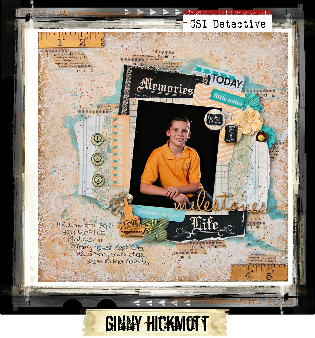
***CSI Case File 237***


Hi all,

Its September 1st and time for a new case file here at CSI - Color Stories Inspiration!

I cant believe its already September, the summer holidays seem to have flown by. I love autumn time but I hate the children going back to school, I do like having them at home. 
This case file is perfect for my thoughts with the school educational theme to it. I used a photo of my son from his last year in Primary school. He looks so young to me in that photo now but at the time he looked so grown up. Another year goes by and he's off to secondary school and then now another year on and he's a young man! They grow up so quickly in that 2 year period, I am dreading my daughter getting to that point, I will make the most of it now! LOL


Here is my interpretation of the case file....


And here is the case file. As its the 1st of the month the case file comes with a sketch too! 


All colours were used from the scheme. Some colours were used more then others. The red colour is in the mist splats in the background and the dotted line on top of one of the journal cards. The green colour is in the pattern on the BoBunny floral/foliage paper.


My evidence used:


* Grid pattern
* stripes
* people images
* Washi Tape
* school themed stuff


My Testimony:


* Topic: School or something you've learnt


Here are some close and details.....


These journal cards came in the perfect colours or this case file and my photo! The red dotted line can be seen on the top of the 'today' card. The Stash Panache badges were perfect, loved those, from my stash I'd been hoarding for ages! 


The Dusty Attic title was simply painted with a couple of coats from a colour in the Prima metallic set.
My papers had both torn and straight cut edges to add texture and detail. The black papers from the Art of Life collection made my photo pop out from the design.


These brads added a different detail and fun finish along with my stapled papers. My background paper was splattered with a red colour from the Metallic set.


I used 2 different washi tapes torn of the roll and layered up under my papers to add new layers and to blend the edges of the design out. The red colour is also on the washi tape. 


I finished off the design by using a blue colour from the Metallic set with some water and did a wash around the edge of my design to make it pop! I then did a little splatting on the background with the same colour.


Products used in this layout: 


Papers

* Blue Fern Studio: Seaside Cottage: Voyage
* Kaisercraft: Art Of Life: Remember
* Kaisercraft: Art of Life: Brave
* BoBunny: Welcome Home: Home Dreams

Other: 

* Prima: ATC Cards: All About Me #970949
* Teresa Collins: Memorabilia: Decorative Brads
* Washi Tape x2 ( the print one is Tim Holtz)
* Dusty Attic: Word Pack #17 DA1273J
* Stash Panache: Bijou Buttons: take Note Chalkboard
* Prima Wood Icons: Borders set: ruler
* Prima Wood Icons set: Stationers Desk
* Prima Metallic Accents Set Semi watercolour cake: pastels (the red & blue background splatting and the gold on the wood embellishments)
* stapler


We're so excited to have eight generous sponsors this month! Our sponsors are among the best in the crafting industry, offering unique and trendy products.


The deadline for completing this Case File is Saturday, September 30, at 11:59 p.m. EST. Be sure to link your layout on the CSI blog using the link tool in the sidebar, and mention the Evidence and Testimony clues you used. Also, please title your link with your name and country.


          Major Case File No. 237 - Deadline: September 30, 2017


You can find the CSI blog here...


Thank you for stopping by today, I cant wait to see what you come up with!


Ginny :)


Tuesday, 1 August 2017

***Lets Get Sketchy Aug 1st Challenge***

It's August! 
Another month gone and summer is in full swing, my children are now on their summer holidays from school. I have been thinking of all sorts of crafty things I can do with my daughter who loves crafty activities, not so my son!

It's  now time for the August 1st challenge at Let's Get Sketchy! This challenge not only has a sketch but we have a mood board too and a masculine theme going on with it!

Here is my layout.....


And here is the sketch and mood board....


I was inspired with the bright blues, greens and red from the mood board.


My patterned papers are a mix between to different paper lines.
I have user Kaisercraft Class Act and BoBunny Welcome Home paper collections.


I added the polaroid and stars die cuts as my main feature points.


And brads and jump rings as smaller details. All my paper edges have been inked with distress ink. 


On my background I splattered with some mists.


My title is created from some wood scrabble tiles.


The photo is mounted on some red PP from the Class Act collection and my journaling card is just slotted underneath this layer.


I used a stapler to fix all my layers together which also adds more detail and great for a masculine page. I also used eyelets in the corners of the layout and little wood pegs on the photos. 


Products used on this layout


BoBunny: Welcome Home: Dreams
BoBunny: Welcome Home: Front Door
BoBunny: Welcome Home: Key
Kaisercraft: Class Act: Red Paper.
Cosmic Shimmer: Mist: Red Firefly
Cosmic Shimmer: Mist: Blue Lime
Tim Holtz: Distress Ink: Vintage Photo
Sissix Thinlets: Star Die
Twine: red
Polaroid Die
Simple Stories: Awesome Me! paper- the stars
The Works: Scrabble tiles
Teresa Collins: Memorabilia Brads
Staples
Pegs
Eyelets
Jump rings


Thank you for stopping by today to see my layout, don't forget to stop by the Lets Get Sketchy blog to see what the rest of the DT came up with! Follow the link below...


Ginny  :)


Current Design Team